

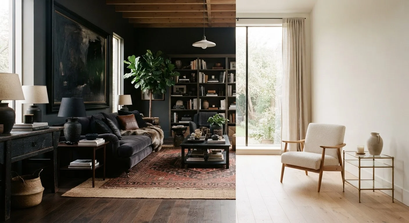
Why Rooms Feel Wrong Even When Nothing Is Wrong
You rearrange the furniture, hang a few pieces of art, add throw pillows in a color you love — and the room still feels off. Not cluttered, not empty, just somehow unsettled. This is one of the most common decorating frustrations, and the cause is usually visual weight.
Visual weight is invisible in the way gravity is invisible. You don't see it acting on a room — you feel the result. When a room's visual weight is unevenly distributed, your eye travels to the heavy side and stays there, unable to comfortably move through the space. The result is a low-level sense of tension that most people feel without knowing why.
Understanding this concept doesn't require a design degree. Once you know what creates visual weight, you can read a room the way a designer does — and fix problems with moves as small as switching a rug or rehinging a piece of art.
What Creates Visual Weight
Several qualities make objects appear heavier or lighter to the eye:
- Color: Dark colors absorb light and advance toward the viewer; pale colors recede. A charcoal sectional carries significantly more visual weight than the same sofa in cream.
- Scale: Larger objects carry more weight, but not always proportionally. An oversized mirror in a pale finish can feel lighter than a small cluster of dark-framed photos.
- Pattern density: Bold, high-contrast patterns draw sustained attention. A busy geometric rug anchors a room more firmly than a solid one of equal size.
- Texture: Rough, layered, or matte surfaces hold the eye; smooth and reflective surfaces release it. This is why layering textures thoughtfully changes a room's entire feel, not just its warmth.
- Complexity: Intricate objects — a carved bookcase, a gallery wall, a collection of ceramics — require more visual processing than simple ones, which reads as heaviness.
Try the Squint Test Before Rearranging
Stand at the room's entrance and squint until the details blur. What you see in blobs of light and dark is your room's actual visual weight distribution. This quick trick strips away color and detail so imbalances become obvious — use it before and after any rearrangement to measure whether a change actually helps.
The Most Common Imbalance Patterns
Most visual weight problems fall into a few familiar patterns:
All the weight is on one wall
A large sofa, floor lamp, and gallery wall on the same side of a room — with little on the opposite side — creates a visual tug of war the empty side always loses. The fix is rarely adding more furniture; it's redistributing contrast. A darker paint on the lighter wall, a single piece of substantial art, or even a large plant can restore equilibrium.
Everything is the same weight
Rooms filled entirely with similarly sized, similarly toned pieces suffer from visual monotony — the opposite problem. The eye has nowhere to land, so it restlessly scans without satisfaction. Introducing one intentionally dominant piece — a statement chair, a bold rug — gives the room a focal point and lets everything else breathe.
Heavy at the top, light at the bottom
Tall, dark shelving units or dramatic window treatments can make a room feel top-heavy and vaguely unstable. Grounding the space with a substantial rug, a low console, or darker furniture near the floor re-establishes a visual foundation. See our room-layout checklist for a methodical way to spot these issues before moving anything.
Asymmetrical Balance Is Still Balance
Symmetry is the most intuitive form of visual balance — matching lamps on either side of a bed, for instance — but it isn't the only valid one. Asymmetrical arrangements pair objects of different sizes and weights to achieve equilibrium without mirroring. A tall floor plant on one side of a fireplace can balance a lower but denser stack of logs on the other. The result often feels more relaxed and less formal than perfect symmetry.
Rebalancing Without Starting Over
You rarely need to buy new furniture to fix a visual weight problem. The most effective adjustments are often small:
- Move one heavy piece to the opposite side. Even shifting a dark armchair from the sofa wall to a facing wall can redistribute enough weight to change how the whole room reads.
- Add weight to a light corner. A tall plant, a floor lamp with a dark shade, or a leaning mirror introduces visual mass without permanent commitment.
- Break up a heavy grouping. If your gallery wall, TV unit, and sofa are all on one wall, consider moving a few frames to an adjacent surface to spread the visual load.
- Use rugs deliberately. A rug centered under a seating arrangement anchors the whole grouping visually — removing or resizing a rug is one of the fastest ways to shift a room's balance.
Rooms that feel effortlessly composed usually have a mix of high and low visual weight throughout — nothing is ignored, nothing overwhelms. For further context on rules that might be holding your space back, common decorating myths are worth examining too.
~60%
Of room dissatisfaction tied to layout and balance
Interior design educators commonly cite proportion, balance, and scale — rather than color or style — as the root cause of most decorating complaints from non-professional decorators.
3–5 moves
Typical adjustments needed to rebalance a room
Design practitioners generally find that redistributing visual weight requires only a handful of targeted changes — rarely a full furniture overhaul — when the imbalance is identified precisely.
Frequently Asked Questions
Dark color, dense pattern, large scale, rough texture, and visual complexity all increase an object's perceived weight. A small dark sculpture can outweigh a large pale lamp because the eye is drawn to contrast and detail.
No. Symmetrical balance — matching items on either side of a center point — is just one approach. Asymmetrical balance places objects of different sizes and weights to achieve equilibrium, and often feels more relaxed and modern.
Yes. A lamp or spotlight draws the eye, effectively adding visual weight to whatever it illuminates. A poorly lit corner can feel heavier because it reads as dark mass, while a lit corner feels lighter and more open.
Stand at the doorway and squint slightly — blurring the detail forces you to see the room in blocks of light and dark. If one area looks noticeably darker or more visually dense than the rest, that's where the imbalance lives.
Absolutely. Each object adds some degree of visual weight, and cumulative clutter creates an overall heaviness that no single piece explains. Editing accessories — even temporarily — is often the fastest way to diagnose imbalance.
The content on this site is for informational purposes only and is not a substitute for professional advice. Always consult a qualified professional for guidance specific to your situation.