

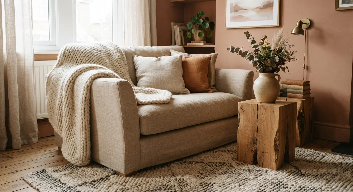
Why Colour Alone Isn't Enough
You can nail the paint shade, arrange furniture thoughtfully, and still end up with a room that feels somehow lifeless. The culprit is almost always the same: every surface in the space reflects light in an identical way. When walls, upholstery, cushions, and shelving all share the same smooth, matte, or shiny finish, the eye has nowhere to travel. The room reads as flat.
Texture is what gives a room its sensory signature. It determines how light bounces and bends, how shadows pool around objects, and whether a space invites you to stay or simply passes your gaze through it. Interior designers call this tactile contrast — the intentional mixing of surfaces that feel and look different from one another. You don't need a professional to apply it.
If you've been relying on colour to carry all the work, our guide to why dark paint succeeds or fails explains what else needs to be in place for colour to land the way you intend. Texture is almost always part of that answer.
Start With What You Already Own
Before buying anything new, walk through your home and gather every textile, ceramic, or natural object you own. Rearranging existing items — a wooden bowl moved to a side table, a woven basket repositioned as a plant holder — often reveals textural combinations you hadn't noticed. Texture work frequently costs nothing at the start.
Seven Textures Worth Layering
Soft wovens: the room's first layer of warmth
Upholstered furniture and cushions form the default soft layer in most rooms, but wovens go further. A chunky-knit throw draped over a sofa arm, a boucle cushion beside a linen one, or a woven cotton blanket folded over a reading chair — each of these introduces a surface that catches light unevenly and registers as warm to the eye even before you touch it.
The key with soft wovens is to vary the weave tightness. Pairing a tightly woven linen cushion with a loosely knitted throw gives you contrast within the same material family, which reads as intentional rather than chaotic.
Varying weave tightness within one material family creates contrast without visual clutter.
Raw and finished wood: the grounding element
Wood is one of the most versatile texture contributors in a room because it comes in so many surface states: raw-sawn, wire-brushed, smooth-lacquered, whitewashed, or darkly stained. Each reads differently under light and sits differently beside other materials.
Where rooms go wrong is using only one wood finish throughout. A lacquered dining table beside a wire-brushed console and a raw timber shelf creates a family of related tones with real surface variation. If you're thinking about flooring as part of this, comparing hardwood, engineered wood, and laminate is a useful starting point for understanding how surface texture differs between options.
Using one wood finish throughout a room misses the depth that surface variation creates.
Matte ceramics and stoneware: quiet but essential
A matte ceramic lamp base or a cluster of stoneware vessels on a shelf doesn't shout — but remove them, and the room loses something hard to name. Matte ceramics absorb light rather than reflecting it, which makes them act as visual anchors that slow the eye down.
Their surface quality also contrasts well with nearly everything: glossy finishes, smooth wood, shiny metal. One or two well-placed ceramic pieces in a room can do more textural work than a shelf of identical smooth objects. Look for pieces with visible throwing marks, uneven glazing, or a slightly gritty surface — these read as genuinely tactile even from across a room.
Matte ceramics absorb light and slow the eye, acting as anchors in a visually busy space.
Metal accents: contrast without drama
Brushed or blackened metal introduces a hard, cool surface that sets off softer materials by contrast. It doesn't need to be a dominant feature — a metal-framed mirror, a brass candle holder, or iron cabinet hardware is usually enough.
The important distinction here is between polished and brushed finishes. Highly polished metal reflects like a mirror and can compete with other surfaces for attention. Brushed or matte metal reflects light diffusely, which gives you the material contrast without the visual noise. In rooms where visual weight is already unbalanced, polished metal can tip things further.
Brushed metal adds material contrast without the visual competition of a polished finish.
Stone and concrete: grounding a room's palette
Stone surfaces — whether a marble tray, a slate coaster set, or a concrete planter — introduce real geological variation: veining, pitting, colour shifts within a single object. This is the kind of irregular surface that manufactured materials struggle to replicate convincingly.
Even a small stone element grounds a room's palette in a way that feels organic. It also pairs particularly well with warm soft materials like wool or linen, because the contrast between cool, hard stone and warm, soft fabric is one of the most instinctively satisfying textural combinations in interior design.
Stone's natural surface variation — veining, pitting, colour shift — is impossible to replicate with manufactured materials.
Plants and dried botanicals: living texture
Foliage introduces a texture type that no manufactured material can substitute: irregular, organic, and slightly different every day. A large-leafed plant beside smooth upholstery creates an immediate and striking contrast. Dried grasses or seed pods in a vase add bristly, linear texture that reads differently from any woven or ceramic surface.
The practical constraint is light. Plants only work where conditions allow them to thrive, and a struggling plant adds nothing texturally or visually. Matching plants to your space and light conditions is worth thinking through before committing.
Foliage introduces irregular, organic texture that no manufactured material can replicate.
Layered rugs and textile floor coverings
The floor is the largest surface in most rooms and the most commonly under-textured. A flat, low-pile rug is better than bare flooring, but a layered approach — a flat-woven base rug under a smaller, higher-pile piece — gives you both definition and textural richness.
Rug layering also allows you to introduce a weave type that you're not ready to commit to in a larger format. A small sheepskin or a jute runner layered over a cotton rug costs less than a full jute area rug and gives you the surface variety without the commitment. For sizing logic and when layering works well, the full guide on rugs as room-definers covers the fundamentals.
Layering a smaller high-pile piece over a flat base rug is one of the lowest-cost ways to add floor texture.
Putting It All Together
The goal isn't to crowd a room with materials — it's to ensure that no single surface type dominates without a counterpoint. A useful starting check: stand in the doorway and mentally group everything you see by surface quality. If more than two-thirds of visible surfaces share the same finish, that's where the flatness is coming from.
Think of texture as working in conversation with your other layering decisions. Lighting layers interact directly with texture — rough surfaces catch and diffuse light in ways that smooth ones don't, so a single light source will read very differently across a mixed-material room versus a uniform one. Similarly, a well-chosen rug anchors texture underfoot; sizing and placement matter more than people expect.
For renters who can't make permanent changes, texture is particularly valuable — it operates entirely through objects, not walls. The renting hub covers what's generally within a tenant's rights to modify, but throws, cushions, ceramic pieces, and freestanding shelving with varied finishes require no landlord approval whatsoever.
Texture Also Affects Room Acoustics
Soft, porous surfaces — rugs, curtains, upholstered furniture, cushions — absorb sound and reduce echo. Hard, smooth surfaces — glass, polished concrete, bare walls — reflect it. A room that sounds echoey and hollow is often under-textured as much as it is visually flat. Adding soft materials for acoustic reasons also tends to improve how a room looks, so the two goals rarely conflict.
The content on this site is for informational purposes only and is not a substitute for professional advice. Always consult a qualified professional for guidance specific to your situation.