

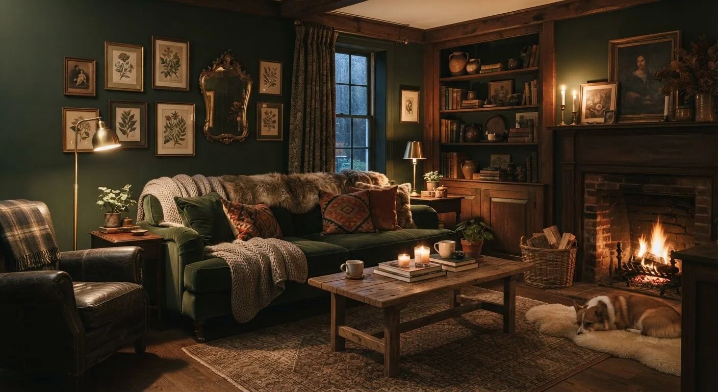
The Role of Light: Natural and Artificial
Natural light is the single most important variable. A south-facing room flooded with afternoon sun can carry a deep charcoal wall without feeling oppressive; the same shade in a north-facing room with minimal windows risks feeling genuinely gloomy. Before committing to a dark colour, observe how the room's light shifts through the day and note its orientation.
Artificial lighting matters just as much after dark. Cool overhead bulbs — especially recessed downlights — strip warmth from dark rooms and create a flat, shadowy effect. Switching to warm-spectrum bulbs (around 2700K) and introducing layered lighting through floor lamps, table lamps, and wall sconces creates pockets of glow that make dark walls feel enveloping rather than oppressive. The goal is to avoid relying on a single overhead source.
Test Paint in the Actual Room First
Paint at least one large swatch — ideally a full section of wall — and observe it across morning, afternoon, and evening light before committing. Colours shift significantly depending on the time of day, direction of natural light, and the artificial lighting you use. A colour that looks perfect on a chip in a bright shop can look entirely different on your north-facing wall at 7pm.
Proportions, Ceiling Height, and Where You Apply the Dark
Room geometry shapes the outcome as much as the colour itself. Dark paint on walls with a high ceiling — say, nine feet or more — tends to read as dramatic and intentional. Apply the same paint to a low-ceilinged room and it can press down on occupants. In low rooms, painting only the walls (keeping the ceiling white or a lighter tint) preserves airiness while still achieving depth.
Some designers extend dark paint onto the ceiling for a 'cocoon' effect, which can be deeply effective in rooms used for intimacy — a reading nook, a bedroom, a home cinema. For rooms where people need to feel alert or where tasks are performed, this approach warrants more caution. The more surfaces the dark colour covers, the more important it becomes to counterbalance with warm light and reflective objects.
This connects directly to visual weight in interior design — dark surfaces carry significant visual weight, and a room where that weight is concentrated on one plane may feel unbalanced.
Sheen, Texture, and the Objects Around the Walls
The finish of the paint changes its character. A flat or matte dark wall absorbs light and creates a soft, velvety quality — ideal for cosy rooms. A satin finish bounces some light back, adding a sense of depth without brightness. Semi-gloss can make a dark colour feel almost lacquered, which works in dining rooms or libraries but can feel cold in more casual spaces.
What you place in front of dark walls is equally decisive. Light-coloured furniture, pale upholstery, and reflective surfaces — mirrors, brass hardware, glass — create contrast that keeps the room from feeling like a single dark mass. Without contrast, dark rooms flatten. For more on how layering material variety solves this, see how textures create richness in a room.
~25
LRV threshold where rooms feel noticeably darker
Light reflectance value (LRV) is a standardised measure of how much light a paint colour reflects; most dark feature colours fall between 5 and 20.
2700K
Ideal bulb colour temperature for warm ambience
Lighting professionals generally recommend bulbs rated 2700–3000K for residential spaces seeking a warm, inviting atmosphere — especially with dark walls.
12×12 in
Minimum recommended swatch size for colour testing
Paint manufacturers and colour consultants widely recommend testing large wall swatches rather than small chips to accurately judge how a colour will read in context.
Colour Temperature and Undertones
Not all dark colours behave the same way. Dark blues and blue-greens can feel cold and receding, especially in rooms with limited warm light. Dark earthy tones — deep terracotta, warm brown-black, olive — tend to read as more welcoming in everyday living spaces because they carry warmth in their undertones.
Testing a large paint swatch — at least 12 by 12 inches — in the actual room, observed at different times of day, is non-negotiable. Chip cards are deceptive; the undertone you see in a shop under fluorescent light will read differently on four surrounding walls at dusk. For readers used to navigating neutral decisions, the same undertone logic explored in choosing between warm and cool whites applies here, just with higher stakes.
Also worth noting: the idea that dark colours belong only in large rooms is one of the most persistent myths in decorating, and following it uncritically often results in rooms that feel generic rather than considered.
Prep Matters More With Dark Paint
Dark colours are less forgiving of surface imperfections than light ones — every bump, patch, or roller streak becomes more visible. Proper wall preparation, priming, and the right application technique make a meaningful difference to the final result. For a detailed look at how to get the surface ready before you open the tin, see the steps professionals follow for interior painting.
Frequently Asked Questions
Yes — and the idea that small rooms always need light colours is a common myth. A small room painted a deep, consistent colour can feel intentionally intimate rather than cramped. The key is managing lighting and adding enough contrast through furnishings and trim so the space doesn't feel muddy.
A matte or eggshell finish absorbs light and creates a soft, enveloping effect that suits cosy spaces. Satin and semi-gloss sheens reflect more light, which can make a dark colour feel livelier but also highlights wall imperfections more. The right choice depends on the look you want and your wall condition.
Painting the ceiling the same dark colour as the walls creates a wrapped, intimate effect — often called a 'cocoon.' A white or light ceiling lifts the room visually, adding contrast and breathing room. Low-ceilinged rooms often benefit from a lighter ceiling to avoid feeling oppressive.
Cool-toned or harsh overhead lighting clashes with dark walls and creates a flat, institutional feel. Switch to warm-spectrum bulbs and use layered lighting — table lamps, floor lamps, sconces — to create the sense of warmth that makes dark rooms feel deliberate rather than dim.
North-facing rooms receive cooler, indirect light that can make cool-toned darks like blues and grey-greens feel harsh. Warm dark tones — ochre-brown, burgundy, terracotta — tend to work better in low-light orientations because they don't fight the cool daylight quality.
The content on this site is for informational purposes only and is not a substitute for professional advice. Always consult a qualified professional for guidance specific to your situation.