

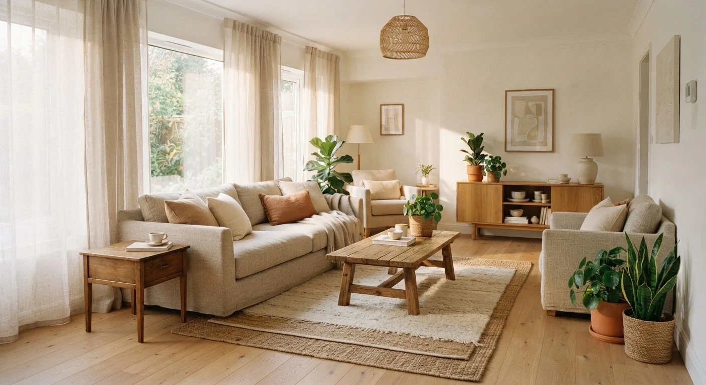
Option A
Warm White
The inviting, cosy-feeling classic.
Best for: Rooms with north-facing or limited natural light, and spaces where you want a soft, lived-in feeling.
Option B
Cool White
The crisp, modern, light-amplifying alternative.
Best for: Bright south- or west-facing rooms, contemporary interiors, and spaces where you want a clean, airy effect.
Why 'White' Is Never Just White
Walk down any paint aisle and you'll find dozens of whites with names that hint at nothing useful. What actually separates them is their undertone — a subtle secondary colour embedded in the pigment mix. Warm whites lean toward yellow, cream, pink, or peach. Cool whites lean toward grey, blue, or green. On a paint chip under a store's fluorescent lights, the difference can be nearly invisible. On your wall, in your light, it becomes obvious.
This matters because white walls don't exist in isolation. They interact with the colour of your incoming light, your flooring, your furniture, and even the paint on adjacent walls. A white that looks crisp and neutral in one home can appear dingy or cold in another. Understanding undertones is the foundation of getting it right — and it's why two people can buy what's labelled the same shade and have completely different results.
For more on how light and colour interact in unexpected ways, see our piece on why dark paint makes some rooms feel cosy and others gloomy.
How Light Direction Shapes Your Decision
Before you pick a paint sample, look at your windows. Light direction is the most reliable predictor of how a white will behave in a room.
North-facing rooms receive indirect, bluish light throughout the day. This naturally amplifies cool undertones in any paint — so a white with grey or blue in it can feel stark or even clinical. A warm white with yellow or cream undertones acts as a corrective, bringing balance and softness.
South-facing rooms get warm, golden light for most of the day. That light intensifies yellow undertones, which can push a cream-leaning white into looking aged or off. A cool, slightly grey-white stays truer to its intended colour under those conditions.
East-facing rooms get cool morning light and warmer afternoon light, making them relatively forgiving. West-facing rooms receive warm, raking evening light that can make warm whites feel orange-tinted by late afternoon. A cooler white often performs more consistently across the day in west-facing spaces.
| Criterion | Warm White | Cool White |
|---|---|---|
| Primary undertones | Yellow, cream, pink, peach | Grey, blue, green |
| Best light direction | North- or east-facing rooms | South- or west-facing rooms |
| Effect in low light | Feels cosy and inviting | Can feel cold or stark |
| Effect in strong sunlight | May appear yellow or aged | Stays crisp and fresh |
| Works best with | Wood, rattan, brass, linen | Concrete, chrome, grey stone |
| Style fit | Traditional, rustic, transitional | Contemporary, minimalist, industrial |
| Forgiveness across rooms | More forgiving in open plans | Better suited to defined, bright spaces |
The quality of your artificial lighting matters too — not just the fixtures but the bulb temperature. Incandescent and warm-LED bulbs (around 2700K) will amplify warm undertones; daylight bulbs (5000K+) bring out cool ones. Our guide to layering lighting in a room explains how bulb choice and fixture placement interact with wall colour.
Reading the Room: Furnishings, Flooring, and Finishes
Light is the biggest variable, but it isn't the only one. The materials already in your room will either harmonise with your chosen white or create visual friction.
Warm materials — oak and pine floors, rattan furniture, terracotta tiles, brass hardware, linen and jute textiles — pull naturally toward warm whites. Placing a cool white behind them can make the room feel as though the walls and furniture belong to different design schemes.
Cool or neutral materials — concrete floors, grey stone, chrome and stainless steel, white or charcoal upholstery — are well-served by cool whites, which echo rather than fight those tones.
One practical test: hold a pure white sheet of paper against the paint chip you're considering. The undertone of the paint becomes immediately more visible by contrast. Do the same with a sample painted directly on your wall and view it at different times of day before committing.
The Paint Chip Problem
Paint chips are photographed, printed, and viewed under store lighting — none of which reflects your actual home conditions. Undertones that appear subtle on a chip can become pronounced on a large surface. Always purchase a sample pot and test it on your wall. View the painted swatch at multiple times of day, including after dark with your usual artificial lighting switched on.
Remember that white walls alone rarely make a room feel complete. If your space feels flat despite a well-chosen neutral, layering textures is often the missing step.
Testing and Deciding With Confidence
Sampling is non-negotiable. Paint a section at least 12 inches square directly on the wall — not on paper or card — and observe it across morning, midday, and evening light before making a final call. Paint at least two candidate whites side by side if you're undecided. The comparison will reveal undertones that neither chip shows clearly on its own.
Common mistakes to avoid: choosing white based solely on how it looks in the store, testing only in artificial light, or picking the brightest-looking chip assuming it will lighten the room most. Brightness (technically LRV, or Light Reflectance Value) is a separate quality from undertone — a warm white can have a very high LRV while still reading as cream on a north-facing wall.
If you're unsure whether your walls are ready for paint, our guide to surface prep and sheen selection covers what needs to happen before the roller touches the wall. And if you're questioning assumptions you've held about decorating, common decorating myths worth reconsidering is worth a read before you commit to any colour decision.
~55%
Homeowners who repaint due to undertone mismatch
Industry surveys from paint retailers consistently indicate that undertone dissatisfaction — where a white looks different on the wall than expected — is among the most common reasons for repainting within a year.
2700K vs 5000K
Bulb temperature range that shifts white appearance
The Illuminating Engineering Society notes that warm bulbs (2700K) and daylight bulbs (5000K) can make the same wall colour appear significantly different, reinforcing why lighting and paint choices must be evaluated together.
The content on this site is for informational purposes only and is not a substitute for professional advice. Always consult a qualified professional for guidance specific to your situation.