

Why These Myths Stick Around
Decorating rules get repeated so often they start to feel like facts. "Everything must match." "Small rooms need white walls." "Push furniture to the edges to open up the space." These instructions get passed down through home magazines, well-meaning relatives, and even some retailers — and they share a common flaw: they prioritise safety over intention.
Following them produces rooms that look inoffensive but feel generic. If you've ever walked into your own space and felt nothing, one of these myths is probably at work. This article examines the most stubborn ones and explains what actually holds up.
If you're starting completely from scratch, this grounded approach for first-timers offers a logical framework before you bring in any of these principles.
Myth
Everything in a room should match — furniture sets, coordinated accessories, one cohesive colour palette throughout.
Fact
Intentional contrast and variation create visual interest. Rooms where everything matches tend to look staged rather than personal.
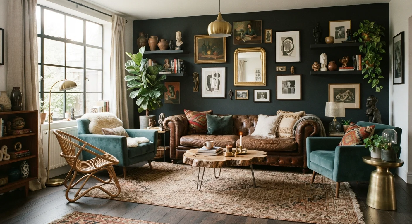
Furniture "sets" became a retail convenience, not a design principle. When every piece shares the same finish, fabric, and scale, the eye has nowhere to travel — the room reads as flat. Experienced decorators typically mix wood tones, combine old and new pieces, and vary materials deliberately. The goal is cohesion, which comes from proportion and colour relationships, not identical sourcing. Start with one or two anchor pieces and build around them rather than buying a matched collection.
Myth
Small rooms must have light-coloured walls to feel larger.
Fact
Colour alone doesn't determine perceived space. Scale, clutter, and lighting have a greater effect than wall colour.
Light walls can help a room feel airy, but a cramped room painted white still feels cramped if it's overfurnished or poorly lit. Conversely, a small room with dark walls, good lighting, and appropriately scaled furniture can feel cosy and intentional rather than claustrophobic. Whether dark paint reads as dramatic or oppressive depends on light levels and scale — not the square footage alone. Don't rule out depth and colour in smaller rooms.
Myth
Push all furniture against the walls to maximise floor space.
Fact
Floating furniture away from walls typically makes a room feel larger and more purposeful.
This is one of the most counterintuitive decorating truths. When sofas and chairs are pressed against walls, the centre of the room becomes an empty void and conversation groupings feel disconnected. Pulling seating inward creates defined zones and makes the room feel used and intentional. In living rooms, a sofa positioned with even a few inches of clearance from the wall — and oriented toward a focal point — usually reads as more spacious, not less. Small-space layout principles explore this in more depth for compact rooms.
Myth
Expensive furniture automatically makes a room look well-decorated.
Fact
Proportion, placement, and layering matter far more than price point.
A costly sofa in the wrong scale for a room, or positioned without a rug to anchor it, will underperform. Meanwhile, a thoughtfully arranged room combining modestly priced and higher-end pieces — with attention to height variation, texture, and lighting — consistently outperforms one where budget was the primary consideration. The most common costly decorating error isn't cheap furniture; it's a visual weight imbalance that no price tag fixes.
Myth
Art should be hung high to draw the eye upward and make ceilings feel taller.
Fact
Art hung at eye level — typically with the centre around 57–60 inches from the floor — reads as intentional and grounded.
The "hang it high" approach often leaves art floating disconnected from the furniture below it. Gallery curators and interior designers typically follow the 57–60 inch centre-height guideline because it aligns with average human eye level. When art relates visually to the furniture beneath it — leaving roughly 6–8 inches between the top of a sofa and the bottom of a frame — the arrangement feels anchored. Gallery wall mistakes often trace back to hanging decisions made without this reference point.
What Works Instead
Replacing bad rules with better ones doesn't mean decorating becomes complicated. In most cases, it becomes simpler — because you stop solving the wrong problem.
Proportion is a more reliable guide than any colour rule. A rug that fits the seating area, a sofa scaled to the room, art hung at eye level rather than near the ceiling: these decisions come from observation, not formula. Rug sizing and placement is one of the most correctable errors in a furnished room, and fixing it often transforms how balanced everything else looks.
Texture deserves as much attention as colour. Layering different materials — fabric, wood, metal, stone adds depth that a single paint colour can't achieve. A room furnished entirely in smooth surfaces will feel flat even if the palette is sophisticated.
Lighting is the variable most people leave until last, even though it affects everything else. A single ceiling fixture is almost never sufficient — ambient, task, and accent lighting each serve different functions, and combining them is what makes a room feel intentional after dark.
Don't Confuse Rules With Principles
Many decorating "rules" are shortcuts invented to sell furniture sets or simplify mass-market advice. Principles — proportion, contrast, light, scale — are more durable guides. When a rule produces a room that feels wrong to you, question the rule first. Trust what you observe in the space over what a formula prescribes.
Finally, personal objects — the things that reflect how you actually live — are what separate a styled room from a comfortable one. Visual weight and balance matter, but balance doesn't require symmetry. It requires attention.
The content on this site is for informational purposes only and is not a substitute for professional advice. Always consult a qualified professional for guidance specific to your situation.