

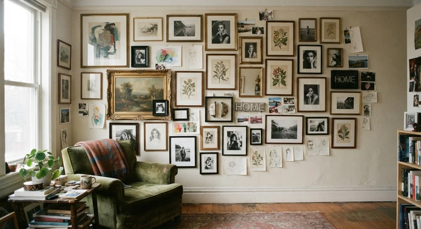
Why Gallery Walls So Often Backfire
Gallery walls look effortless in design magazines and home tours. In practice, they're one of the more technically demanding decorating moves you can attempt — not because the skills are hard, but because the decisions compound quickly. Each new frame affects every frame around it, and small misjudgments stack into a wall that feels restless instead of composed.
The good news: most gallery wall failures trace back to a short list of recurring mistakes. Recognizing them before you start — or diagnosing them in a wall you've already hung — puts you well ahead. Understanding visual weight in decorated rooms is a useful foundation before diving in, because many gallery wall problems are visual weight problems in disguise.
Hanging frames without a floor plan first, working entirely by instinct on the wall.
Why it happens: People underestimate how quickly small spacing errors compound, and drilling feels like progress. Laying frames on the floor seems like extra work when you just want to get started.
Using frames that are all the same size, creating a grid-like repetition that reads as flat.
Why it happens: Buying a matching set feels safe and cohesive. Uniform sizing seems like it should look organized, and it does — but organized isn't the same as interesting.
No unifying element across the collection — different frame styles, colors, subjects, and palettes all at once.
Why it happens: Gallery walls are often assembled gradually, with pieces added over time or pulled from different rooms. Each addition makes sense in isolation, but the wall never develops a shared language.
Hanging the arrangement too high, disconnecting it from the furniture or room below.
Why it happens: Intuition says to avoid low placement, and people tend to err on the high side. The standard advice of "eye level" gets applied to individual pieces but not the arrangement as a whole.
Packing frames too tightly, leaving insufficient breathing room between pieces.
Why it happens: Tight spacing can look intentional in reference images, but those images are usually styled precisely. At home, cramped spacing more often reads as an afterthought or a storage solution.
Ignoring the wall's relationship to nearby furniture, lighting, and the room's overall visual load.
Why it happens: People focus on the wall in isolation and don't account for how a dense arrangement will interact with a busy rug, patterned sofa, or heavily furnished room.
The Principles That Hold a Gallery Wall Together
Behind every gallery wall that works, there's usually at least one unifying decision. It might be a consistent frame finish, a restricted color palette in the artwork, a shared subject (botanicals, black-and-white photography, architectural prints), or a deliberately repeated mat width. You don't need all of these — but you need one.
2–3 in.
Recommended gap between adjacent frames
Interior design guidelines consistently suggest 2–3 inches of spacing between frames to maintain visual clarity and intentionality.
57–60 in.
Ideal center height from the floor
Professional gallery hangers use 57–60 inches from floor to artwork center as the standard eye-level reference point.
Scale variety is equally important. A wall of identically sized frames, even well-spaced, tends to read as wallpaper rather than a curated collection. Mixing large anchoring pieces with medium and small works gives the eye a place to start and a path to follow. Think of the largest piece as a visual anchor — it sets the tonal center of the whole arrangement.
Spacing discipline matters more than most people expect. A consistent gap (typically 2–3 inches between frames) reads as intentional; irregular gaps read as improvised. This is worth measuring rather than eyeballing. If you're working with an asymmetrical arrangement, maintain consistent spacing locally — between adjacent frames — even if the overall shape is irregular.
For anyone building their room's visual language from the ground up, the approach outlined in starting a room from scratch applies directly: anchor decisions first, then layer outward.
Don't Skip the Wall Anchor Check
Gallery walls often involve multiple fasteners close together. Before hanging anything heavy, confirm you're drilling into studs or using appropriate drywall anchors rated for the frame weight. Clustered holes in drywall without anchors can cause frames to shift or fall. If you're unsure about load capacity, consult a hardware professional rather than guessing.
Gallery walls also interact with your room's existing elements more than people anticipate. A densely packed arrangement above a sofa can visually compress the whole seating area. The room layout checklist is worth consulting before you commit to a wall position, especially if furniture is involved. And if you're drawn to the idea of covering a lot of wall real estate, read an honest account of what maximalist decorating actually demands before going all-in.
The content on this site is for informational purposes only and is not a substitute for professional advice. Always consult a qualified professional for guidance specific to your situation.